Client:
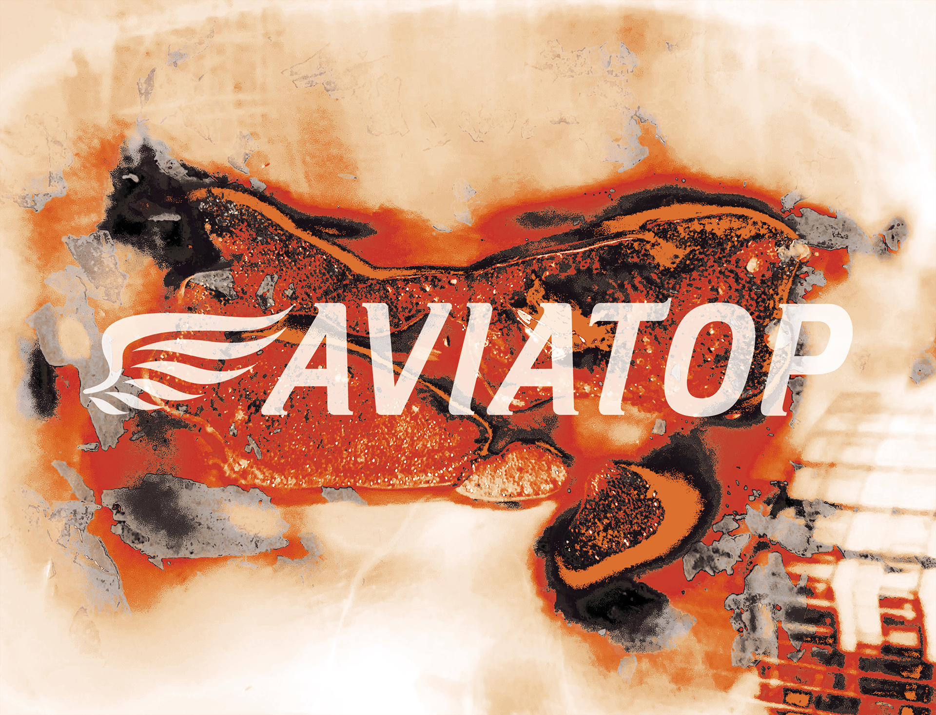
Aviatop Fuel, Russia (Aviation gasoline manufacturer)
In collaboration with Plague Brew, Russia (Contract brewery from Saint-Petersburg).
Brief:
Produce a limited edition canned bock lager to be served at aviation events, with potential for a long-term collaboration to enter Plague Brew's distribution chain.
Initially, the client wanted to use cans, which look like barrels to fit in with Aviatop's products.
Charity campaign:
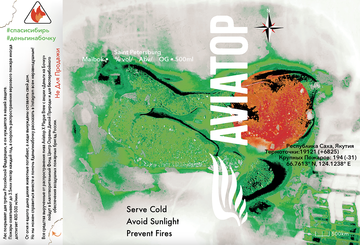
Rather than simply creating a promotional product, Aviatop Fuel wanted to raise funds for charities, specifically ones for the yearly wild fires in Siberia.
My role:
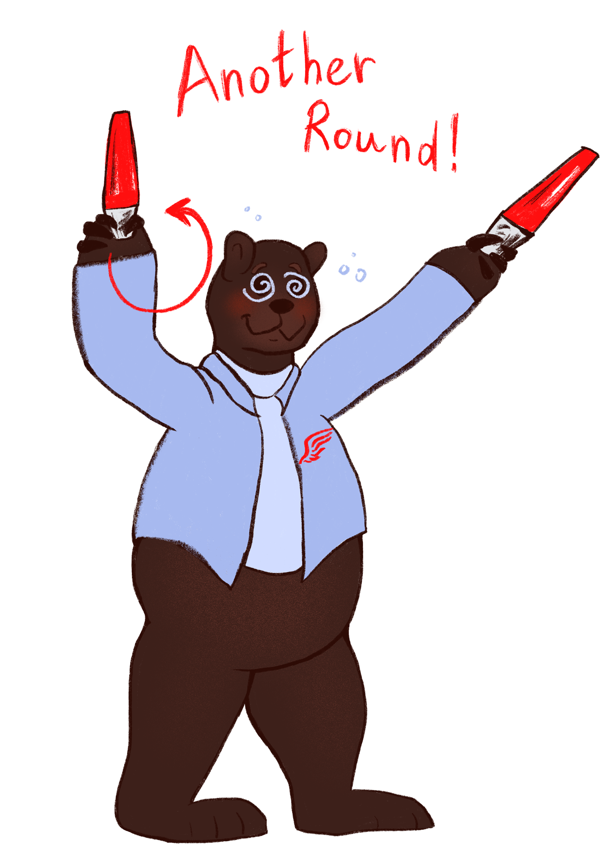
Design a label for the alcohol cans, and create promotional materials for social media.
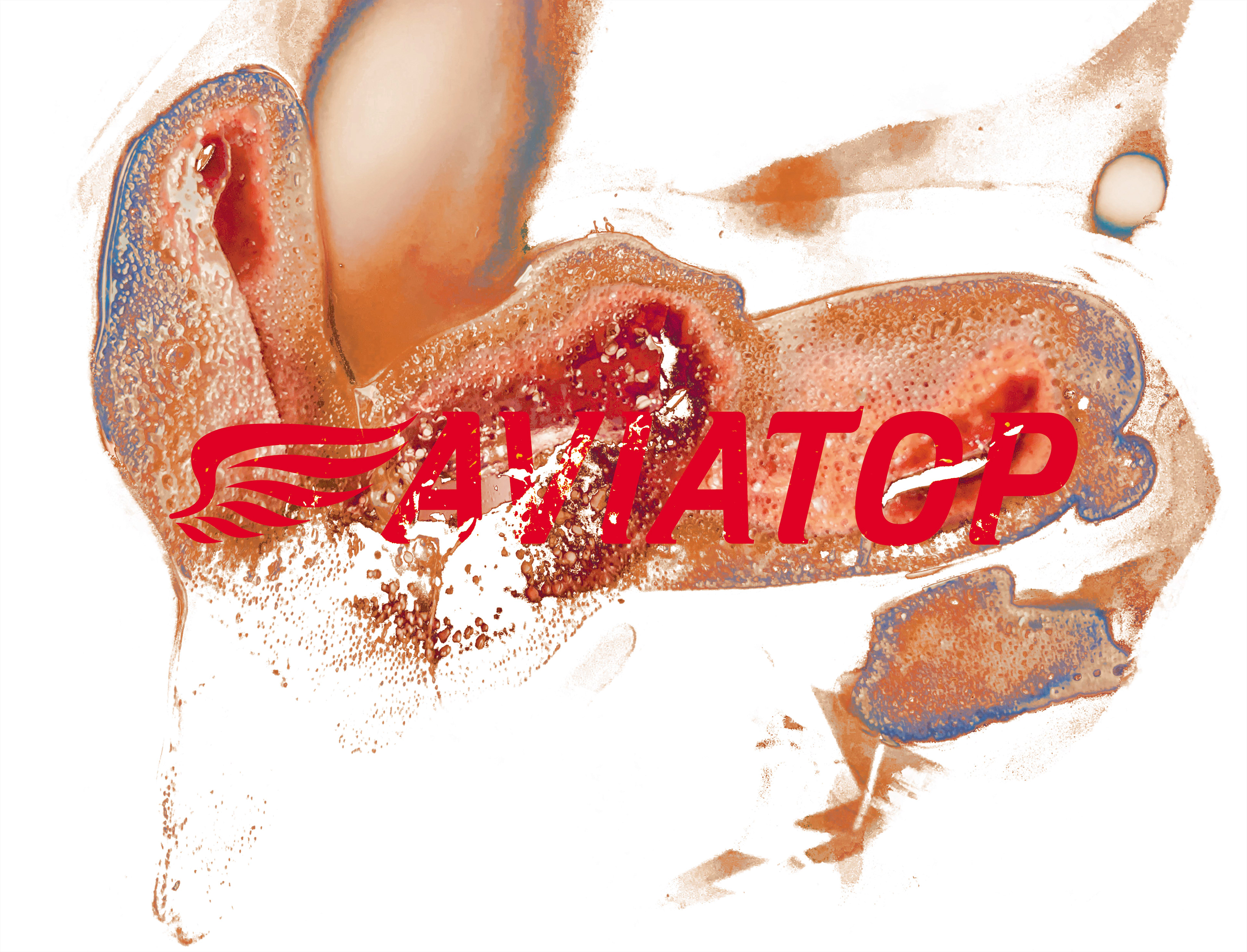
Plague Brew's previous labels seemed to be mostly abstract, focused on patterns or texture. I decided to use fire as the beginning of my creative process. I burned a few polaroids and then put those photos into Photoshop.
I also did some quick paintings using ink and watercolour to capture the fluidity of fire. I used charcoal as well as a very literal references to the burnt woods.
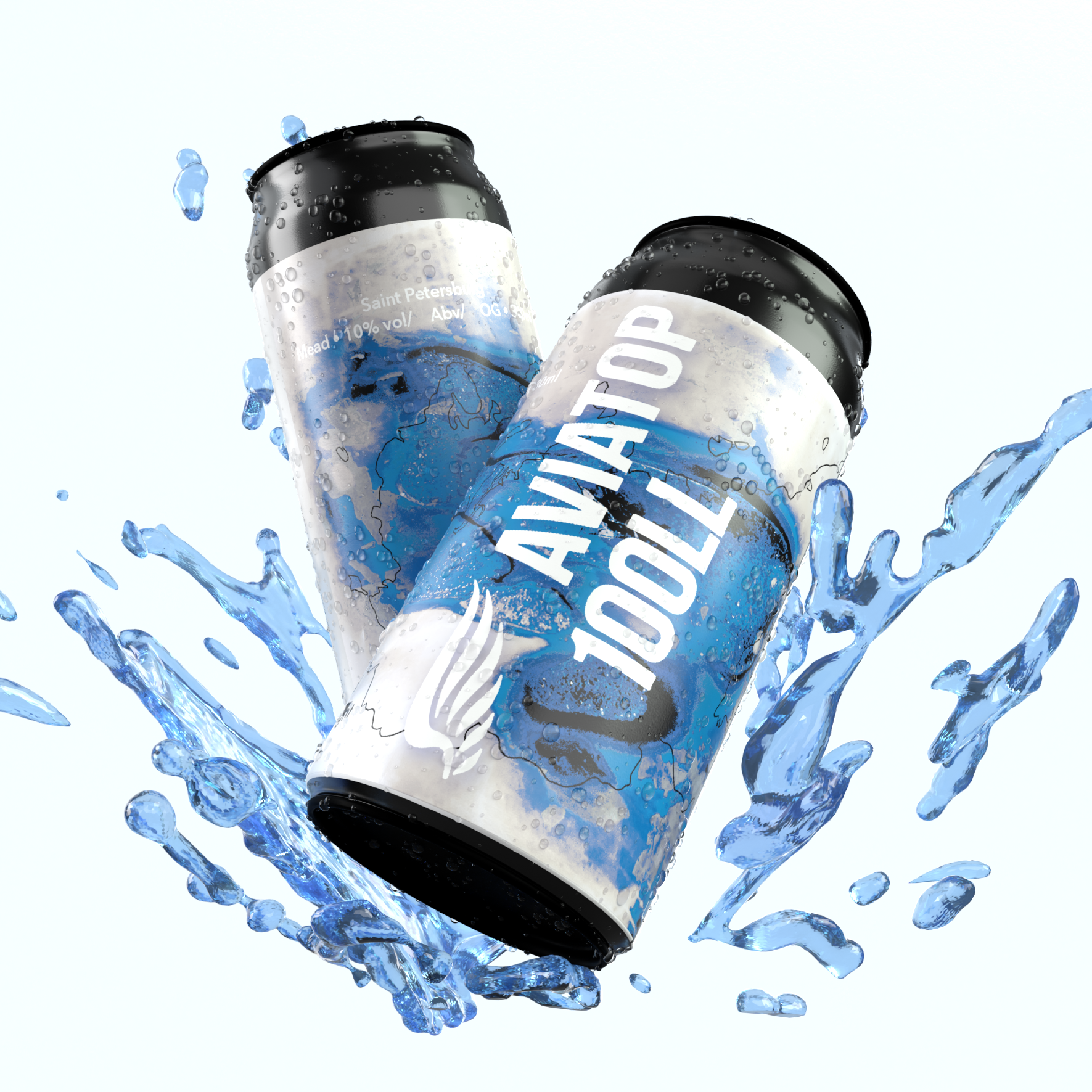
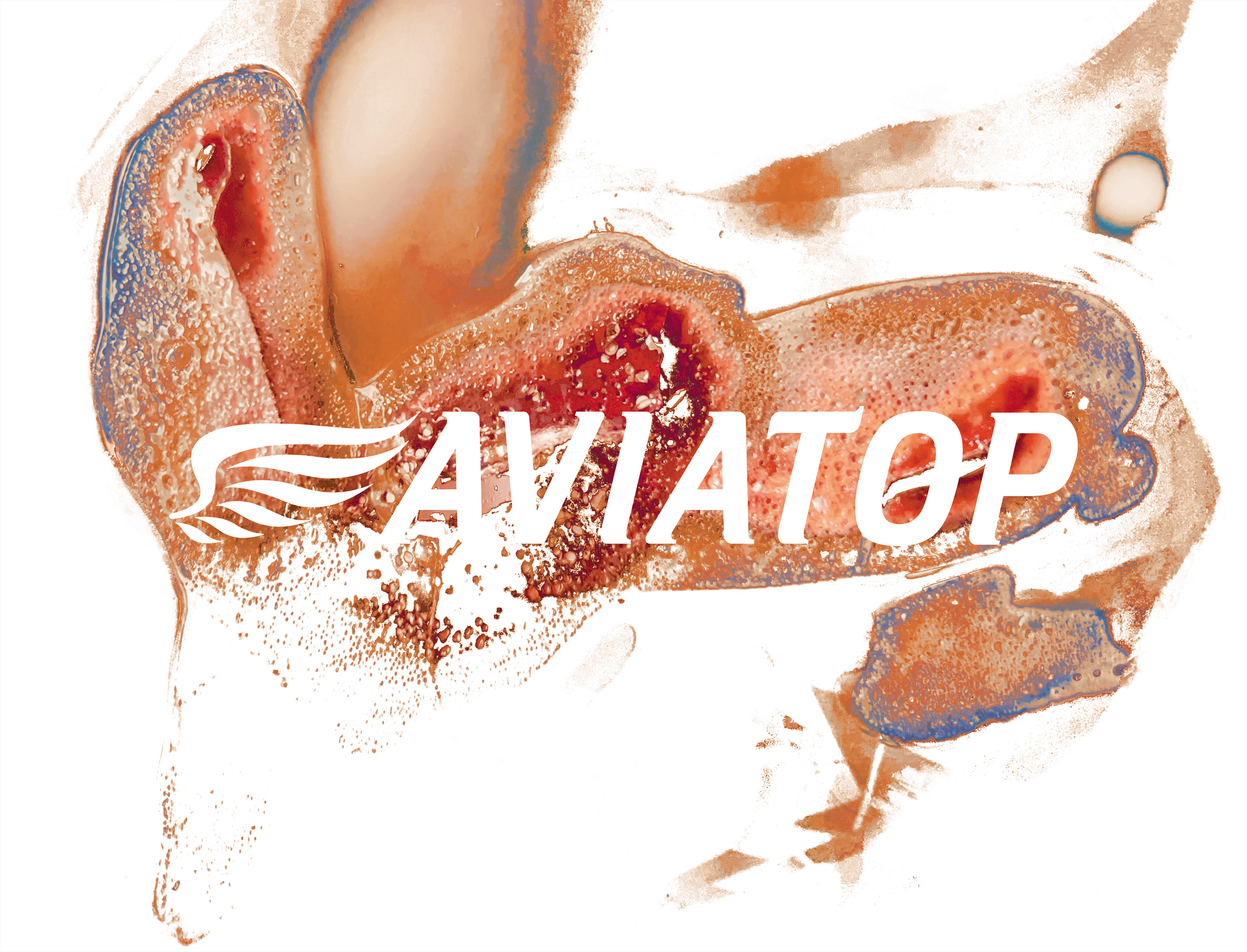
During the development, Aviatop informed me that they're going to use white metal cans rather than black. They also insisted on a red palette to match their logo and branding. I began experimenting with using the Aviatop logo as negative space, cutting through the burn mark.
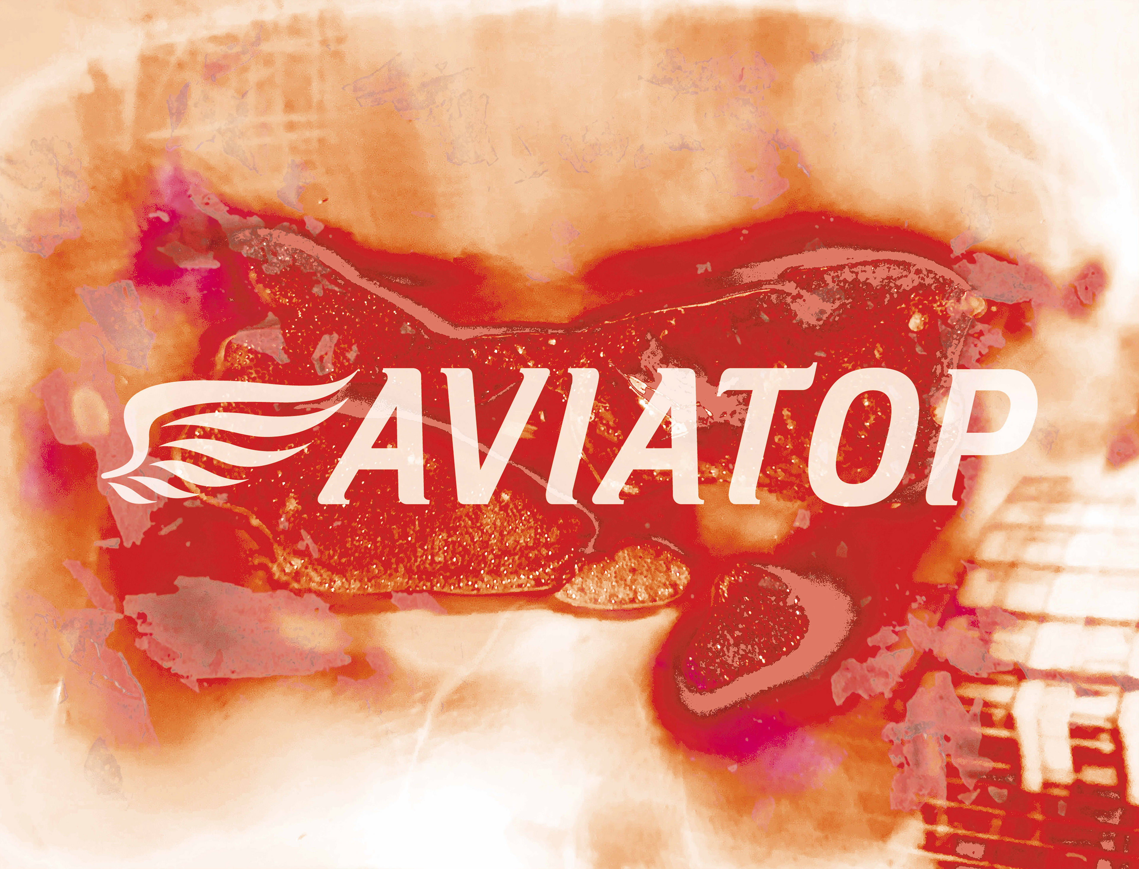
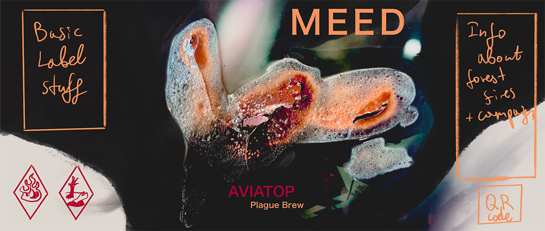
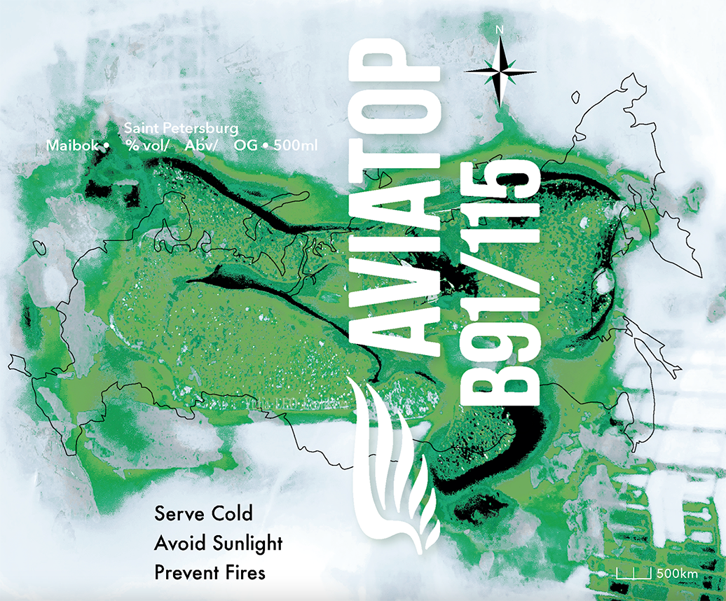
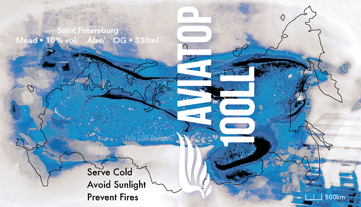
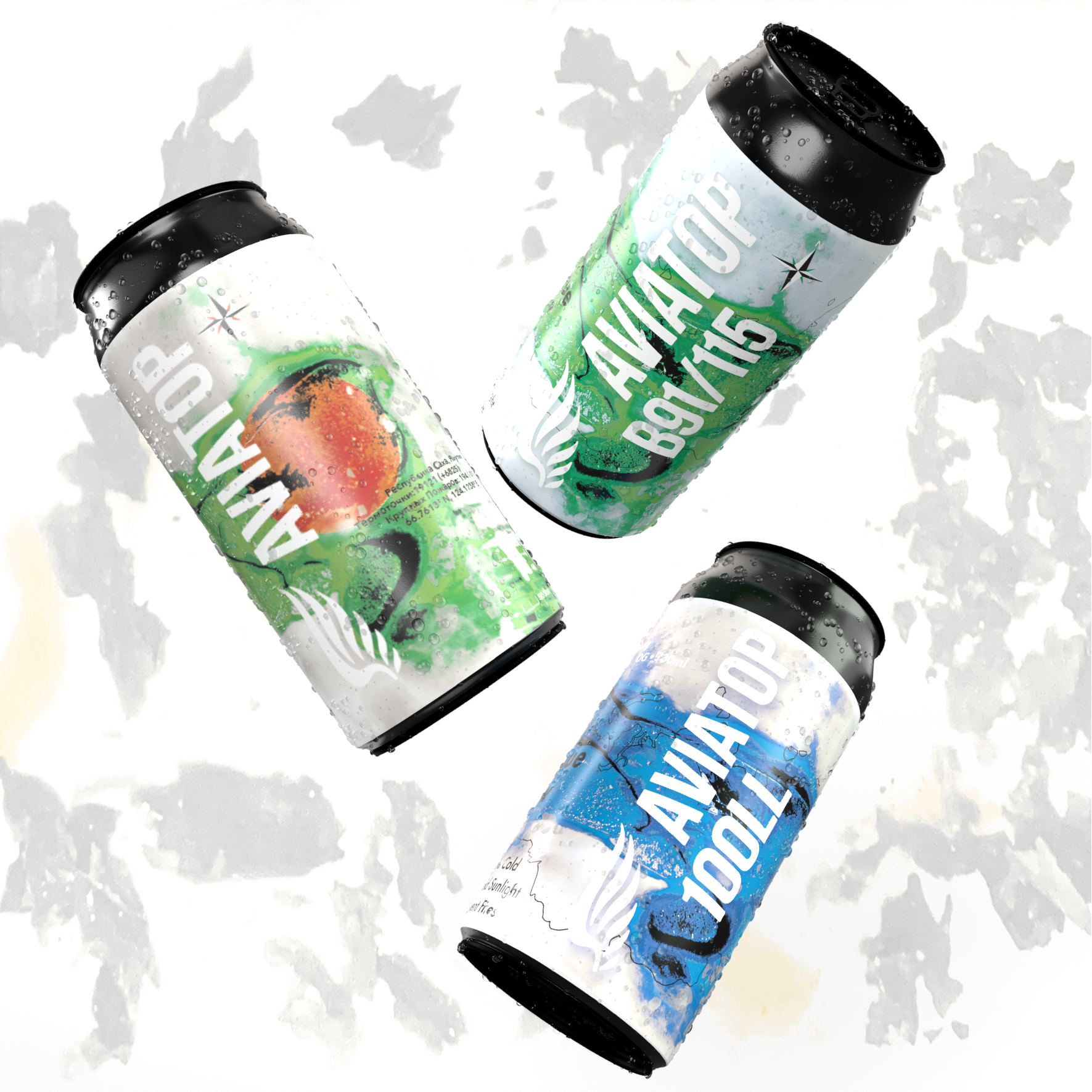
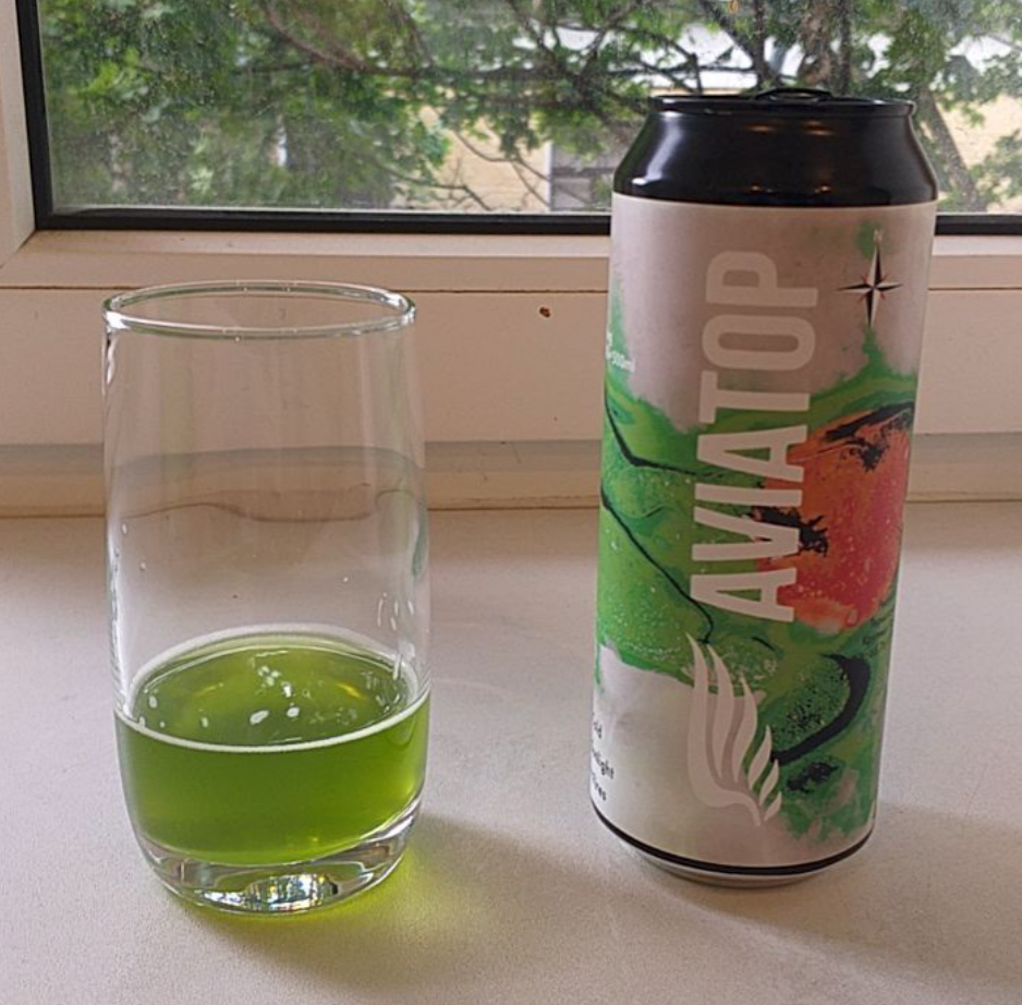
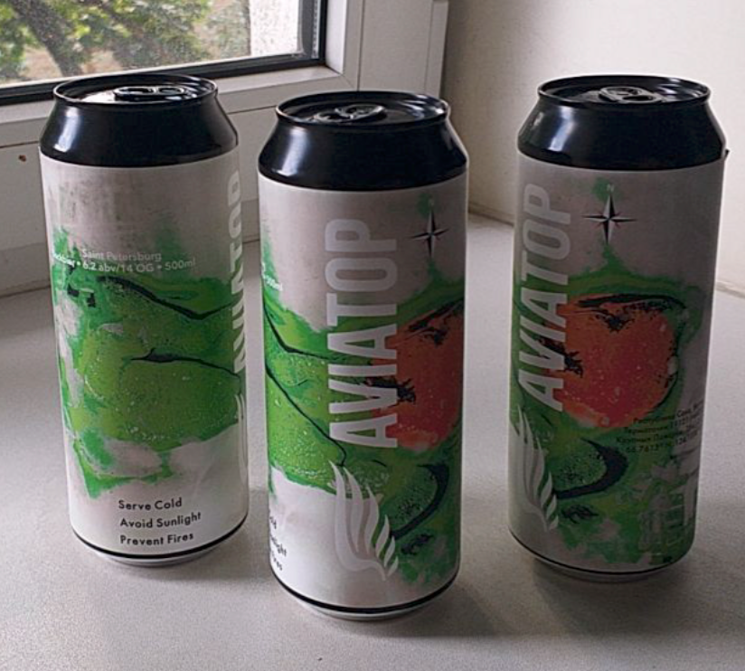
More changes were made after mutual agreement to include more green to represent the forests. Aviatop also made an executive decision to print three different labels. This way, they would have 600 copies of the limited edition label focusing on wild fires, and two different versions, more reflective of aviation, slowly to be rolled out and distributed by Plague Brew.
Aviatop produces two kinds of avgas, which are colour coded - B91/115 as green and 100LL as blue.