University Project
Brief:
Design one colour illustration(s) for Ohh Deer's Subscription boxes.
The general approach for the company seems to be friendly and casual. They promote creativity and playfulness, and a lot of their advertising is humorous. Their subscription boxes offer art and craft supplies, stationary, cactuses and jewellery. At the time of the original live brief, however, they only offered a mixed art and stationary box.
Mediums:
Relief Print, Adobe Photoshop, Adobe Dimensions
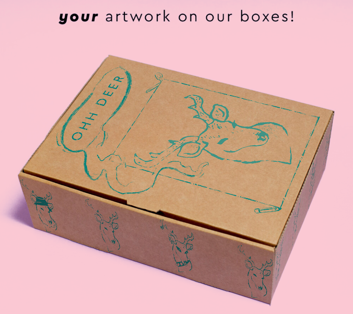
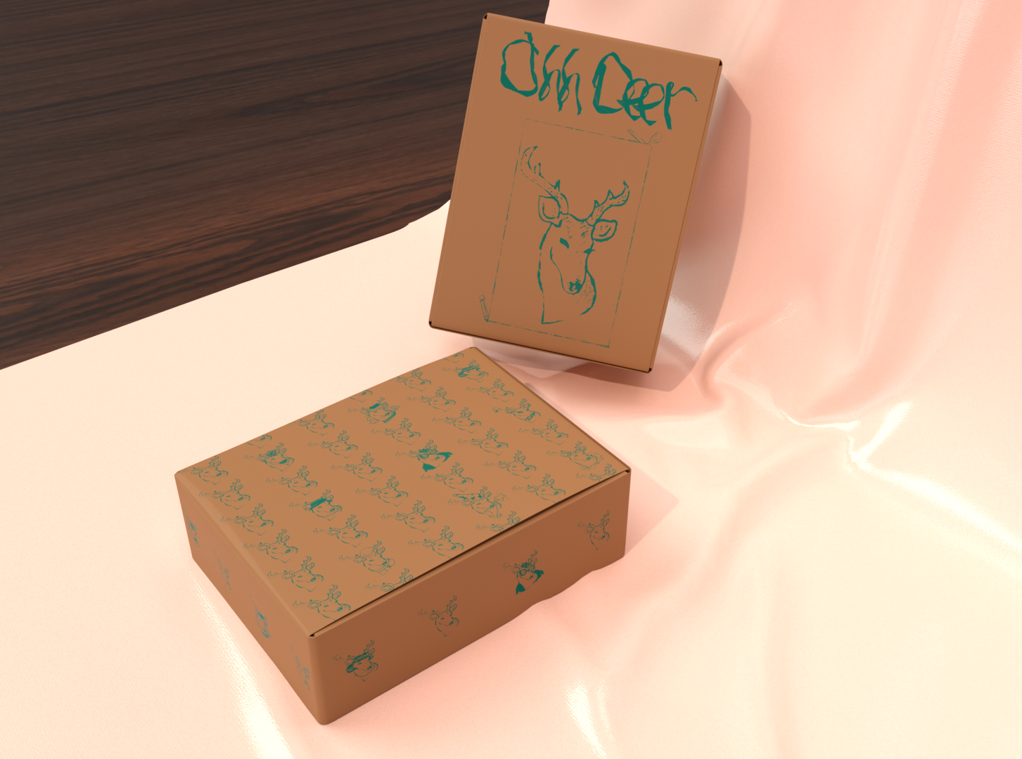
I was imagining a busy, energetic and colourful design for the boxes. For colour, I decided to use turquoise, which can be seen across Ohh Deer’s website. I was also considering creating a pattern.
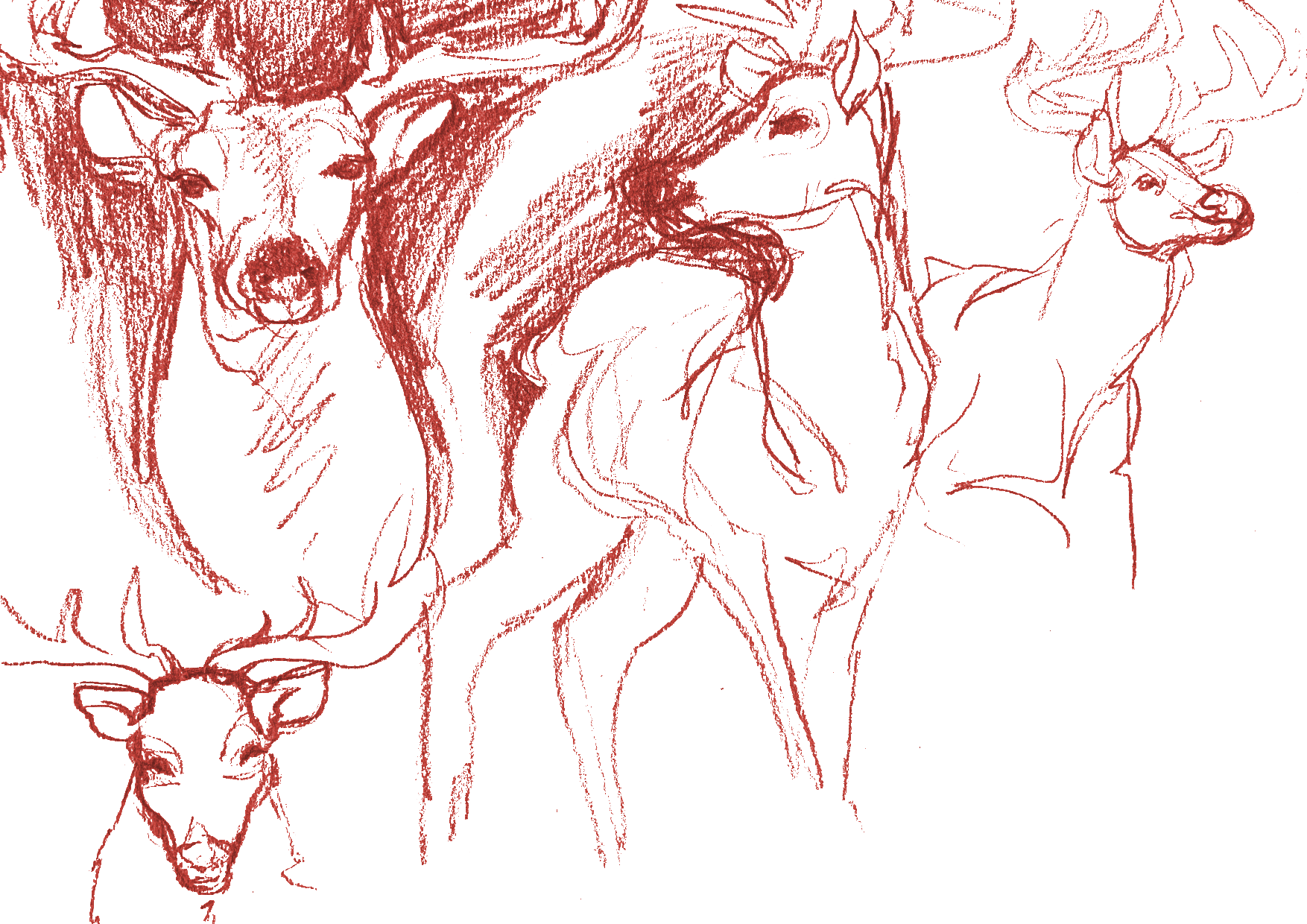
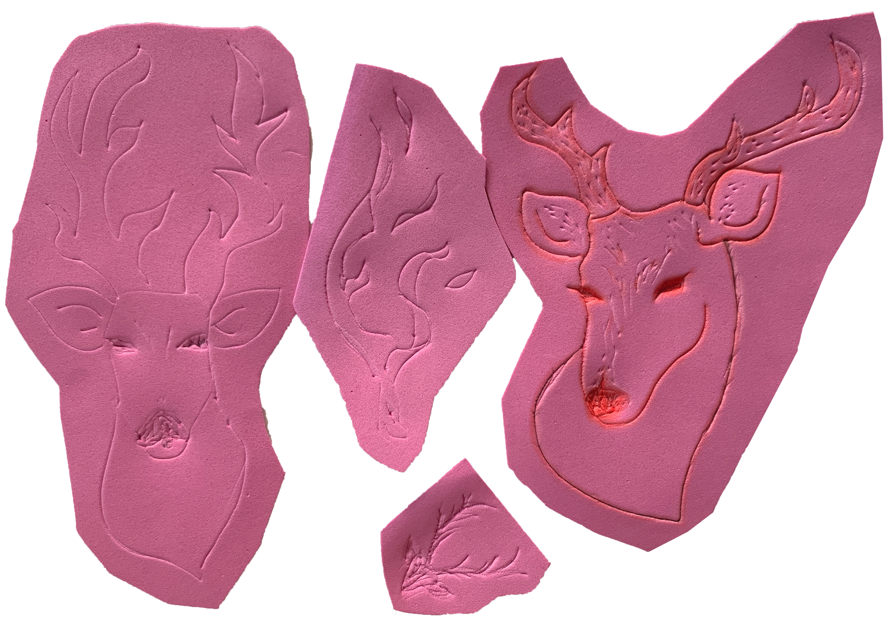
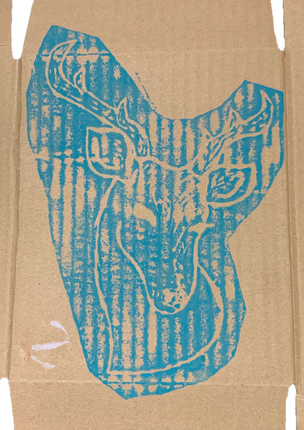
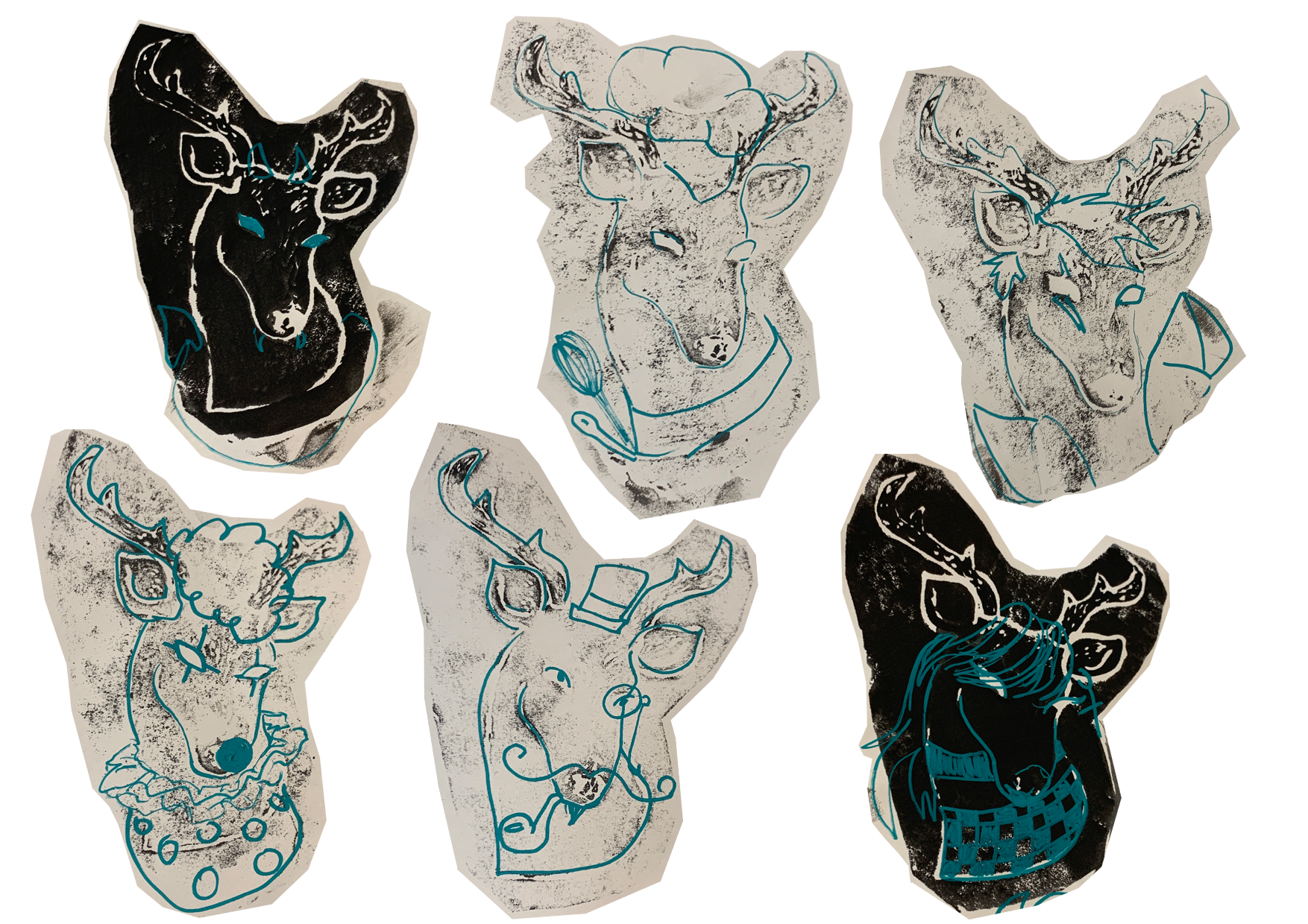
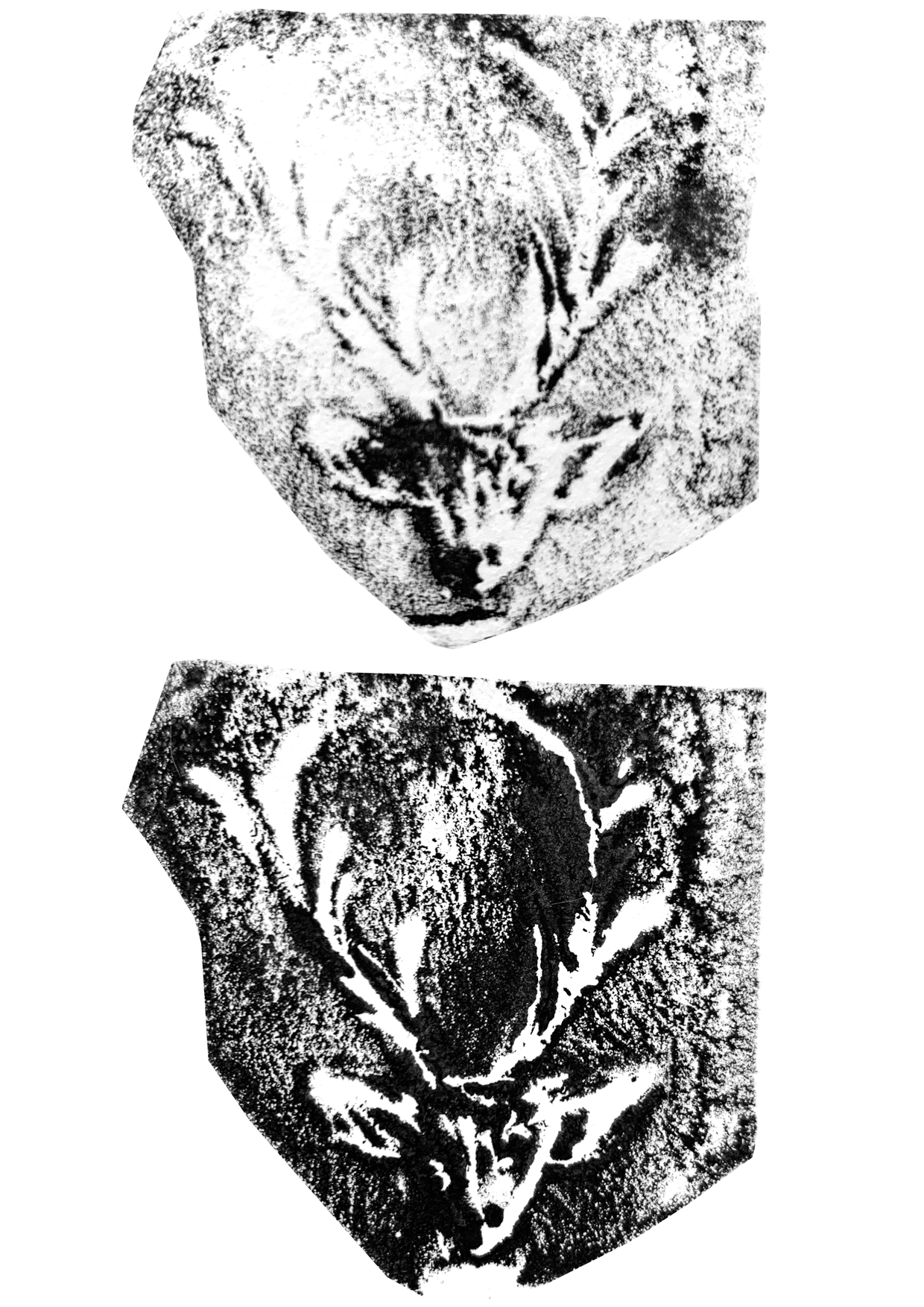

Since the brief did not have many specifications, I went with the direct approach and began sketching deer. I tried to simplify the drawings and then transferred them onto foam card, which I can use for relief printing.
It was pointed out that the company name Ohh Deer was chosen simply because they like and often use puns, and deer were rarely found on any of their actual packaging or advertisements. However, I also received feedback that clichés aren’t necessarily bad, as they are easy to recognise by viewers and can be made more creative.
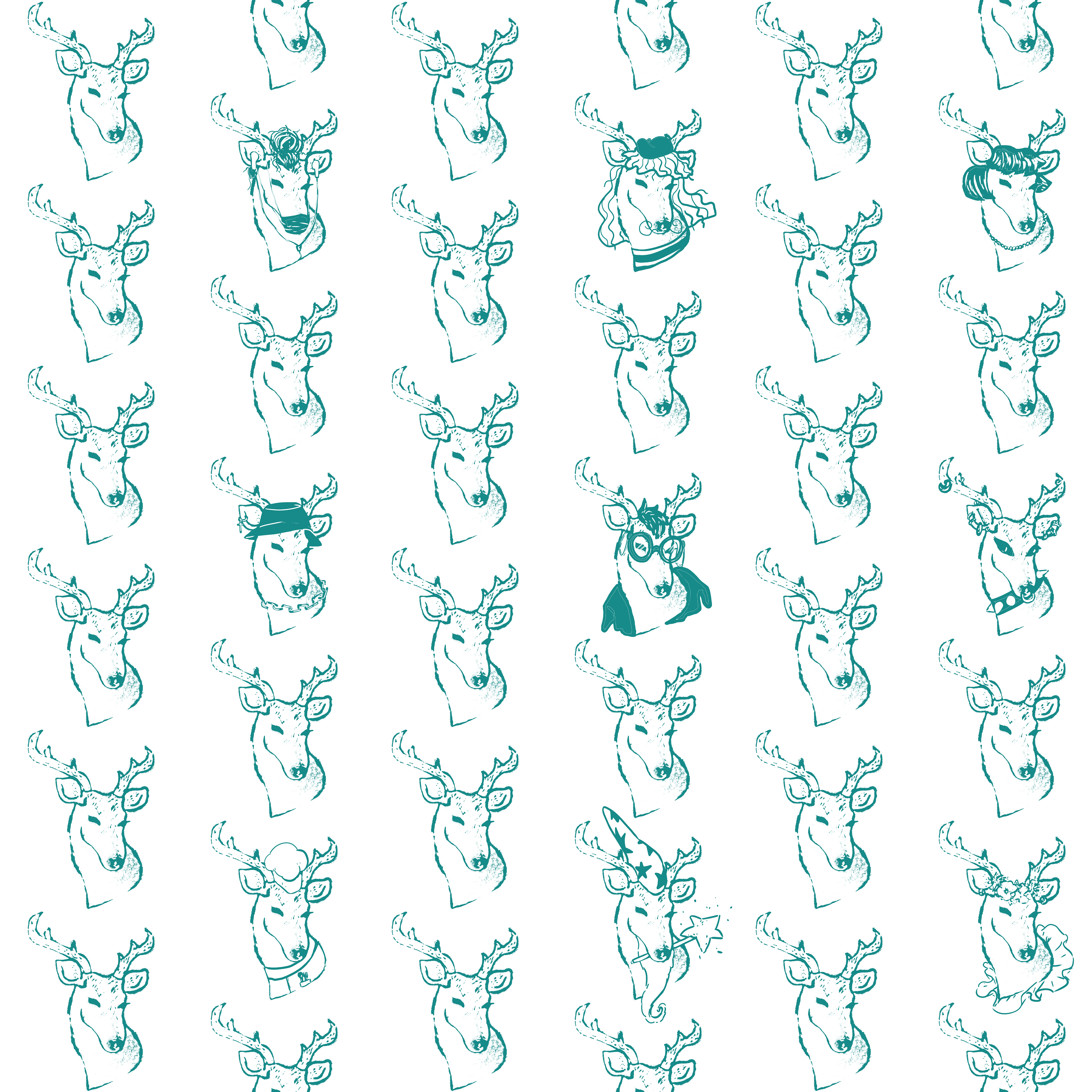
I tried a few options within Photoshop, which generate a pattern but I found that most of them weren’t very fitting as they looked more like wrapping paper or a wallpaper. I decided to go with a simple grid with enough space between the deer to be able to add more details.
I tried to imagine what kind of people might be drawn to Ohh Deer and their subscription boxes. I kept the drawn elements simple so they are easy to recognise and distinguish, without overwhelming the overall pattern.
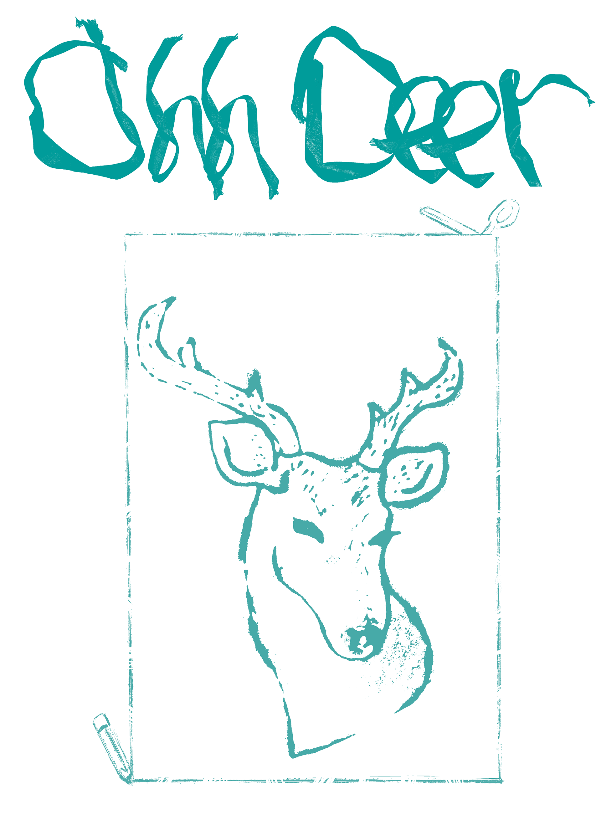
I wanted to make it even more obvious that people are encouraged to draw on this box. I took the base image of the deer and put it inside a frame to imitate a portrait. The frame is very simple with a perforated line, to indicate that it can be cut out and kept as an art piece. To further push this idea, I drew scissors and a pencil in opposite corners.
The main thing I kept in mind during this whole project was how to encourage easy and intuitive interaction with the design and box.